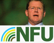
NFU 2009: NFU launches new logo

The NFU has unveiled a new logo – which aims to promote the industry in a more modern light and the union itself as ‘a voice’ for farming.
The union has ditched its old logo which featured curved lines which were meant to represent plough lines.
The rebranding exercise is understood to have cost the unions in the ‘high tens of thousands of pounds’ and will cost more to roll out on stationary and promotional material.
The new logo, launched at the 2009 NFU Conference, has a rainbow next to the letters NFU. The rainbow can be animated so the rings slowly appear one by one and give the impression that the union is ‘transmitting’ or amplifying information outwards.

NFU director of communications Liz Falkingham said the logo was about presenting the union as a modern organisation representing a modern industry.
Research had found that farmers were frustrated by the fact that farming had an outdated ‘Vicar of Dibley’ image, when the reality was that many were keen adopters of technology.
Ms Falkingham said the colours of the rainbow had been chosen to represent the colours involved in farming from soil to the sky.
“It was about giving the logo a modern fresh look – not about radical change.”
Tell us what you think about the new logo on the forums.

